But, I'm trying to keep my hand in. This week, I decided to shoot some bottles of local wine. The Sacramento Valley is generally considered too hot to produce quality wines, but a couple of local wineries are having real success with Italian varietals. One winery that is doing extremely well is Bertagna Son Kissed Vineyards.
I've met Bert and Carol Bertagna on several occasions in my previous incarnation as a wine writer for a local newspaper, and I've followed their wines with interest for several years. When I saw that our local Costco had started carrying their wines (!!!), I picked up a few bottles and decided to shoot them.
Before we get too far, let me say that I've done this before - that is, I've taken photos of wine bottles. Glass has to be the most challenging thing to light, because every reflection and every light shows up reflected on the bottle. You have to control your lighting and reflections very carefully. And you have to experiment.
My goal here was to try to do the type of wine bottle 'glamor' shot you see in Wine Spectator ads, where the bottle looks dark and silky, with clear lines.
Having done this before, I knew that I would need long vertical reflectors on both sides of the bottles. Having only one reflector of the proper size, I used a white sheet on the opposite side. I also wanted the left side to be brighter than the right, so I placed two flashes on the left compared to one on the right.
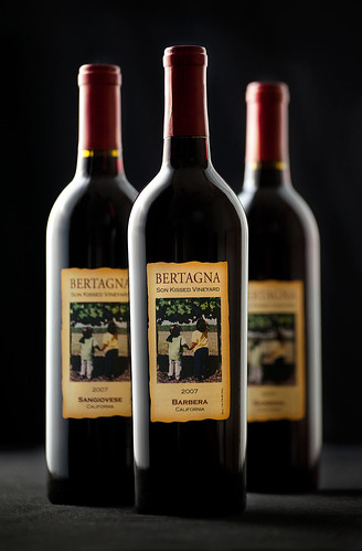
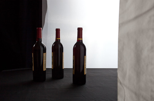
My first shot (below) came out pretty good. There were two obvious issues: the reflections were too large and the labels were way too dark.
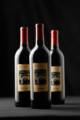
To solve the first problem, I moved the reflectors back 6-8 inches on each side (below). That reduced the size and prominence of the reflections from the reflectors, but also made the labels even darker.
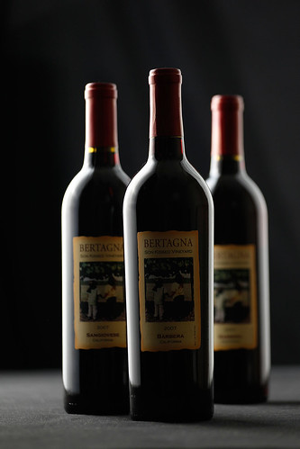
To solve the problem with the dark labels, I placed a 4th light in front of the bottles and shot it through an umbrella (below). The problem with that was that the umbrella left a bright round reflection on the bottle. Moving it around only changed the reflection - it never got rid of it.
This wasn't really a major problem in my mind because I knew I could just merge the image without the front fill with the image with the front fill and use only the parts of each image that I wanted. Since I was triggering the camera wirelessly, I didn't need to worry about lining up the images.
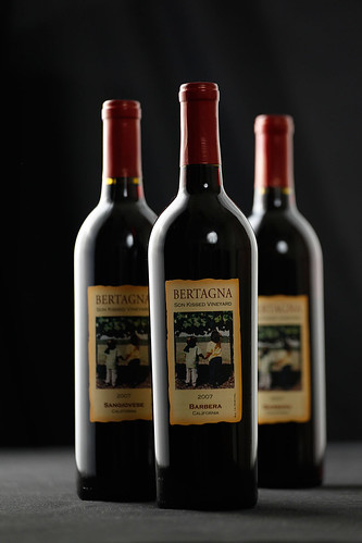
One thing I did notice was that the way the front fill was originally placed, it caused the front bottle to cast a shadow on the second bottle. So I moved the front fill to the left (below). Notice how much brighter the label of the leftmost bottle is in the image below.
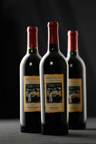
In Photoshop, I merged the two images, using a mask to selectively show only the parts of the image with front fill that I wanted. I added a levels adjustment to the label areas to brighten them even further. I straightened the image, did some minor dust cloning, and cropped the image to give the final image:
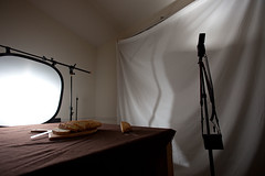
You can see the final lighting set up in this photo:
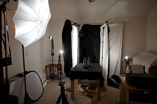
Notice how high the reflectors go. This is necessary to make sure the reflections go all the way up the bottle. Also note the placement of the reflectors relative to the fronts of the bottles.
What amazes me is that the reflector to the right of the bottles was placed at least six inches behind the farthest bottle - and yet it still shows up clearly on the nearest bottle.