The purpose of this post is mostly to start getting back in practice doing food photography. It's been almost two months since we've posted anything, and I've almost forgotten how to use my equipment.
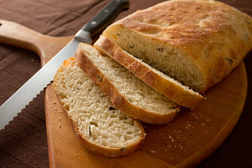
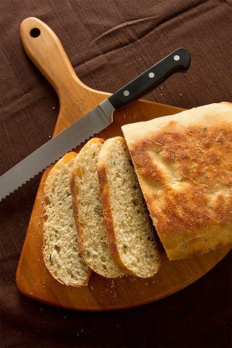
There was certainly no cooking involved in this shot - it's just a loaf of Trader Joe's Herb Foccacia bread (which is quite delicious, by the way).
The Plating
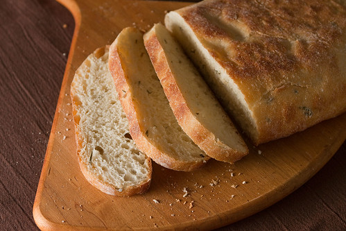
I wanted to go very basic and rustic for this shoot, so I kept the color plate very earthy and full of textures - brown crinkly table cloth, wooden cutting board, lots of bread crumbs. All that goes together to give the images a very rustic look. I tried a number of shots without the knife, but in the end I felt that at least some of the images actually benefited from its presence.
Though I usually am extremely fastidious about cleaning up crumbs and such in Photoshop (partly because I love the process of cloning, truth to be told), I made a point of not cleaning up a single crumb in any of these photos because I wanted to accentuate the gritty, rustic nature of foccacia bread.
The Lighting and Photography

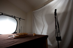
I originally started out with the key light low and close to the left of the bread, with a fill bounced off the ceiling to the rear (see image below).
However, I felt that this lighting was too harsh overall (even though this image came out OK after some post processing), so I placed the key light low and to the rear of the bread, shot through a reflector, and placed the fill light toward the front, bounced off the ceiling at 1/4 power of the key light. I kept the key light very low (almost level with the bread) in order to accentuate the texture of the cut pieces. Had I placed the key higher, there would have been much less apparent texture.
This worked better, overall, but some of the images came out underexposed and rather flat, even with the low angle of the key light. If I was to shoot this again, I might spend more time playing with low side lighting instead of jumping directly to rear lighting.
The other thing I would have done is moved the rear key light closer to the bread. It's about four feet away in the shots above, and that distance softens the shadows and reduces the visible texture in the bread. Moving it to about two feet away would have brought out more texture in the bread slices, though it would have also caused harsher shadows.


No comments:
Post a Comment